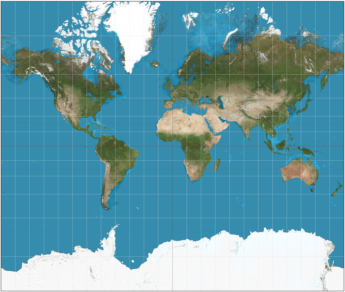
Mercator projection of the Earth, Daniel R. Strebe 2011

Seven little lessons to rediscover our everyday life.
Seven days for the Creation... of a new perspective.
The well-known detail: We open Google Maps, a geographic atlas or any world map. We can identify the proportions of the different countries, the position of the continents, the structure of the whole globe.
The background: The map we all know is untruthful. Or rather, it is a very useful tool but it is inaccurate, like the majority of the maps. The problem arises when you project the spherical surface of our planet on a two-dimensional sheet, and you obviously get a distorted image. The most famous and known projection was made by Gerardus Mercator, a Flemish astronomer and cartographer, in 1569: it owes its good fortune to its ability to represent lines of constant course as straight segments that keep the angles with the meridians, thus facilitating navigation; but in so doing, it gradually distorts the sizes of objects as the latitude increases near the poles. This means that Antarctica and Greenland appear much larger than they actually are, while landmasses near the equator appear smaller.
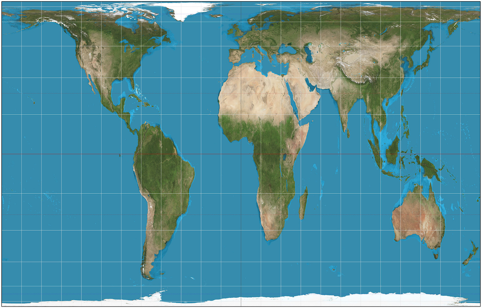
Mercator’s projection is not the only option. In 1973, Arno Peters published a map in which the world was divided into 100 horizontal and 100 vertical sections in order to maintain the correct sizes of the continents. Africa appears to be stretched out but South America looks correctly bigger than North America.
The curious thing about Peters is that he wasn’t actually a geographer, but an historian: this map was part of a wider project aiming at a total rethinking of our concept of human history. In his volume Synchronoptische Weltgeschichte (Synchronous Optical Map of World History, 1952), he tells the story of ancient Greece and Rome in parallel with the story of African, Asian and pre-Columbian people, equating all cultures in order to fight the idea of the Mediterranean basin being the cradle of civilization. This preconception is also the reason why Europe is always depicted in the centre of the maps.
Going ahead with this reasoning, another question inevitably arises: who decided that the North Pole should necessary lie on top? The poles are merely the imaginary extremities of the earth’s rotational axis, but they actually do not lie on top or at the bottom of anything, since in outer space any direction is relative.
But, even cardinal directions have political and psychological implications, as much as placing Europe at the centre of the world.
Researches show that the north-south axis ends up being associated with prejudices. In Italy, the North is associated with the idea of wealth and prosperity, the opposite of the South; in Great Britain or in France the opposite is true, and northern areas are generally considered to be poorer and needier. On a global scale, the Northern Hemisphere still represents the ‘better’ part of the world. According to some studies, it is often sufficient to reverse a map to make this cognitive bias in the observer disappear.
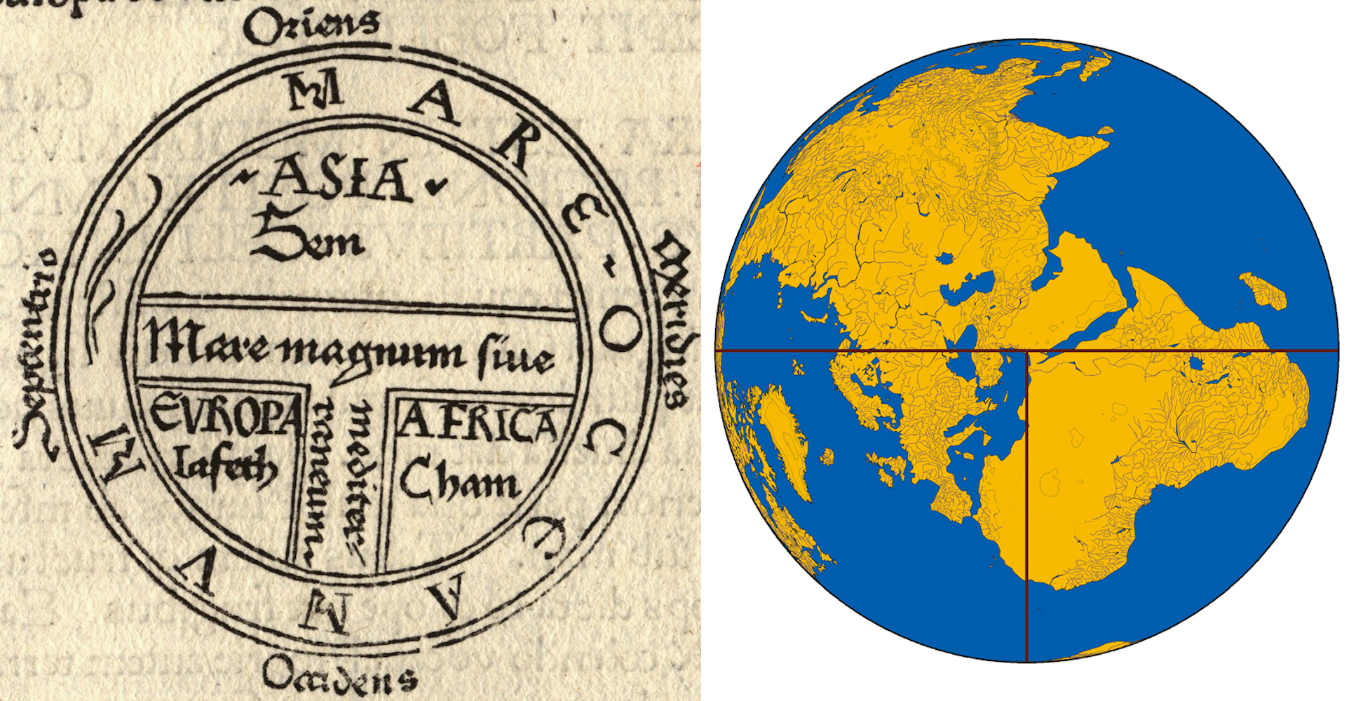
We do not often take into consideration the metaphorical and political implications of geographic maps but they have been existing for centuries. In the Middle Ages, the “T-O maps” were quite common, for instance, as they showed the known world as a circle, the letter O, with a T inscribed inside to represent the Mediterranean Sea, dividing Europe from Asia and Africa. At the centre of these maps lied the most important city to the Christian civilization: Jerusalem. The world map appearing on the UN emblem surrounded by two olive branches conveys a completely different symbolic meaning. It represents an azimuthal equidistant projection centred on the North Pole and has been chosen in order not to give prominence to any particular country.
The Third Lesson: If all geographic maps are distorted, the same goes for the mental maps we use every day. According to the philosopher Alfred Korzybski, all abstractions we make in order to better understand reality work only if we keep in mind that they are mere simplifications. Also, language is a system of signs and should not be confused with the objects it refers to: the word ‘snow’ is not white, a map is not the territory, judging people ‘bad’ on the basis of their actions is an oversimplification. As we saw with the Mercator projection, having a clear “world view” – always discerning north from south, right from wrong, black from white – can be useful and convenient provided we don’t believe too much in it, risking to forget the vast complexity of the real world.